Skip to content

More Data

The Hitchhiker's Guide to Data Analytics

Menu
  • About
  • Blog

Category: Data Visualization

Hospital image from Pixabay
Analytics / Data Visualization

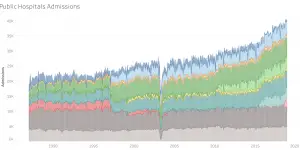
(An attempt in) Quantifying Supply Induced Demand in Public Healthcare Facilities

One interesting phenomenon observed in public healthcare is that when additional healthcare capacity, such as hospitals, are added, the resultant demand for healthcare resources seems to grows and fill the …

Analytics / Data Visualization

Simple projection of Singapore’s population using historic data

My initial attempt at projecting Singapore’s population for the next 2 decades with as simple a model as possible. Another work related task as population has been established (or assumed?) …

Analytics / Data Visualization

Embeddings for Medical Diagnosis Codes

Few months back I embarked on a new journey- still in data science, but in the field of public healthcare. Quite a change from the world of travel and web …

Analytics / Data Visualization

Exploring healthcare and population datasets from Singapore Department of Statistics

Being in public healthcare has created greater impetus for me to find more datasets relating to different aspects on Singapore, from the economy, to society, and of course, healthcare. Some …

Data Visualization

Busiest MRT Stations in December?

Playing around with the Passenger Volume by Train Stations dataset on LTA DataMall. It’s a pretty cool dataset showing average number of tap ins and tap outs at each station …

Categories

  • Analytics (5)
  • Books (2)
  • Career (1)
  • Data Management (4)
  • Data Visualization (5)
  • Events (1)
  • Google Cloud Platform (2)
  • Google Sheets (1)
  • Python (8)
  • SQL (3)
  • Tracking (1)
  • Updates (2)

Never miss an update!

Get the latest!
Keep Updated
Copyright © 2025 More Data – OnePress theme by FameThemes